Digital
Analytics is becoming more and more core to a business’ strategy. Without a
good Digital Analytics team and implementation in place, a business cannot
measure its performance, set KPIs, test new functionality and spot
opportunities for new product development.
Google
Analytics is the first port of call for most people – but there have been
several challenges while docking the ship here!
The most
common ones have been Data sampling – when looking at segmented data and longer
time frames, Google Analytics samples the data to ensure the speed of the
interface. This causes issues because the business want to see the raw numbers.
Besides, Limited
dashboards – the dashboards can be effective if kept simple, but most of the
time you cannot do what you want to do. No customisation is possible and you
can only add 12 reports to the dashboard.
The new GA
Dashboard tries to address these issues with a more modern UI and we are loving
it!
Why these new changes?
The improved
contextual abilities in the GA dashboard open the door for analytics to help
companies create knowledge capital — the intangible assets that accrue from
deeper insights and better decision-making.
For
Industries such as retail that are facing a data upheaval, managing of
knowledge capital is an essential strategic task, the only route through which
this is possible is data aggregation.
Google
seems to have already thought this through and tries to retain all the features
users cherish while making the metrics — and the insights they yield — easier
to understand as ever more complex analytics are introduced.
What are these exactly?
User Customized Interface:
Google
introduced a redesigned mobile app that provided better at-a-glance insights
for users who wanted highlights without having to view the complete report via
laptop.The app is already a rockstar with a million downloads.
Graduate Hat:
 In most
sections of the new Google Analytics layout, you’ll see a little graduate’s
hat. You can use these to learn more about how to interpret the data you find
throughout Google Analytics
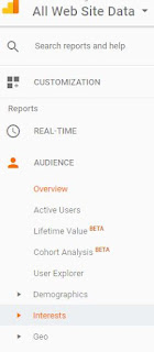
Navigation:
 Everything has moved to the left! Say goodbye
to the navigation at the top; Home, Reporting, Customisation and Admin have all
been relocated. Admin has been relocated to the bottom of the side navigation.
Why?
Because this is more convenient, mak
ing it easier navigating to settings and
back to reports. No more waiting for Google Analytics to reload, the reports
are always waiting for you to the left of the page – meaning you don’t have to
go into the reports view!
Date Ranges:
There’s
some customization involved, too — users with goals or e-commerce will see a
different home page than those without, for example. The various widgets (for
lack of a better term) on
If you ever
find yourself working with the same data range on a regular basis, but when you
login to Google Analytics this date range has been set back to the default, you
will be glad to know that there is now an option to change this date range by
default. The new home page will also offer date filters like “last 7 days” and
“last 30 days” — no need to dive into the various reports for those views.
The impact on businesses
In this era
of digitized brand and business interactions, when insights can seem
disjointed, Google knows that data aggregation represents the vital first step
toward creating the kinds of Predictive, Descriptive and Prescriptive models
that will help devise a more holistic data science strategy.
Looking at
Google’s record-card ,we can confidently predict more prediction. Come what
may, only time will tell what we'll tell of time to come!
